The City of Morristown
SMG was tasked with rebranding and designing a new logo for The City of Morristown, a historic city located in the heart of East Tennessee. The city officials wanted to refresh their brand image to better reflect the city's vibrant culture and rich history while appealing to a wider audience.
After conducting extensive research on the city's history, culture, and demographics, SMG worked closely with city officials to develop a new brand identity. The goal was to create a logo that was modern, yet timeless, and that could be used across various mediums, including digital and print.
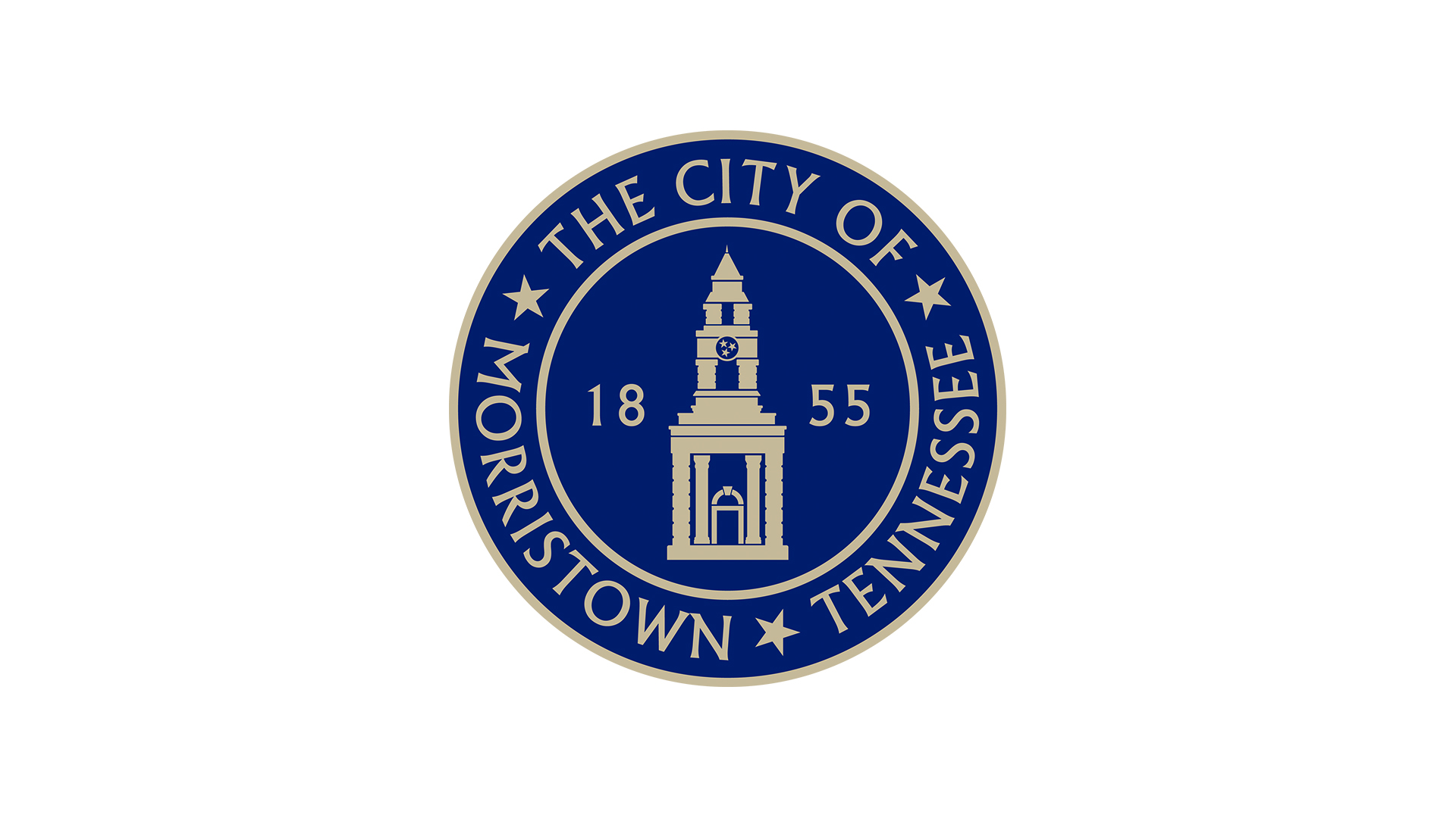
The new logo represents stability and familiarity with a classic look modeled after a city seal. Featured is the main entrance and clock tower of Morristown's City Center, the year Morristown was incorporated, and the Tennessee Tri-Star state flag symbol (located in the clock face).
In addition to the logo, SMG developed a comprehensive branding style guide to ensure consistency across all communications and marketing materials. The style guide included guidelines for typography, color usage, and logo usage, ensuring that the new brand identity was applied consistently across all channels.
The new branding and logo have been well-received by the city officials and residents, and have helped to elevate the city's image with a goal of attracting new businesses and residents. SMG is proud to have played a role in the city's rebranding efforts and looks forward to continuing to support The City of Morristown. We love our community!


